The Reports module provides powerful insights into your team’s performance on respond.io and helps businesses make informed, data-driven decisions. This module is available on all pricing plans, but the depth of reporting features depends on your plan.
The reports available to you will vary based on your plan:
Plan | Available Reports & Features |
|---|---|
Starter | - Real-Time Dashboard |
Growth & Advanced | Everything in Starter, plus: |
Starter plan users will only see a simplified set of widgets (e.g., Conversation and User summaries), while Growth and Advanced plans include all 11 tabs with full metrics, filters, and CSV exports.
All data in the Reports module is shown based on your Workspace Timezone settings. Be sure to configure your preferred timezone to ensure report accuracy.
Data shown in the reports are according to the Workspace’s Timezone settings so ensure that you have set your preferred timezone.
This module is available to Owners and Managers only.
To access:
Navigate to the sidebar menu
Click on Reports
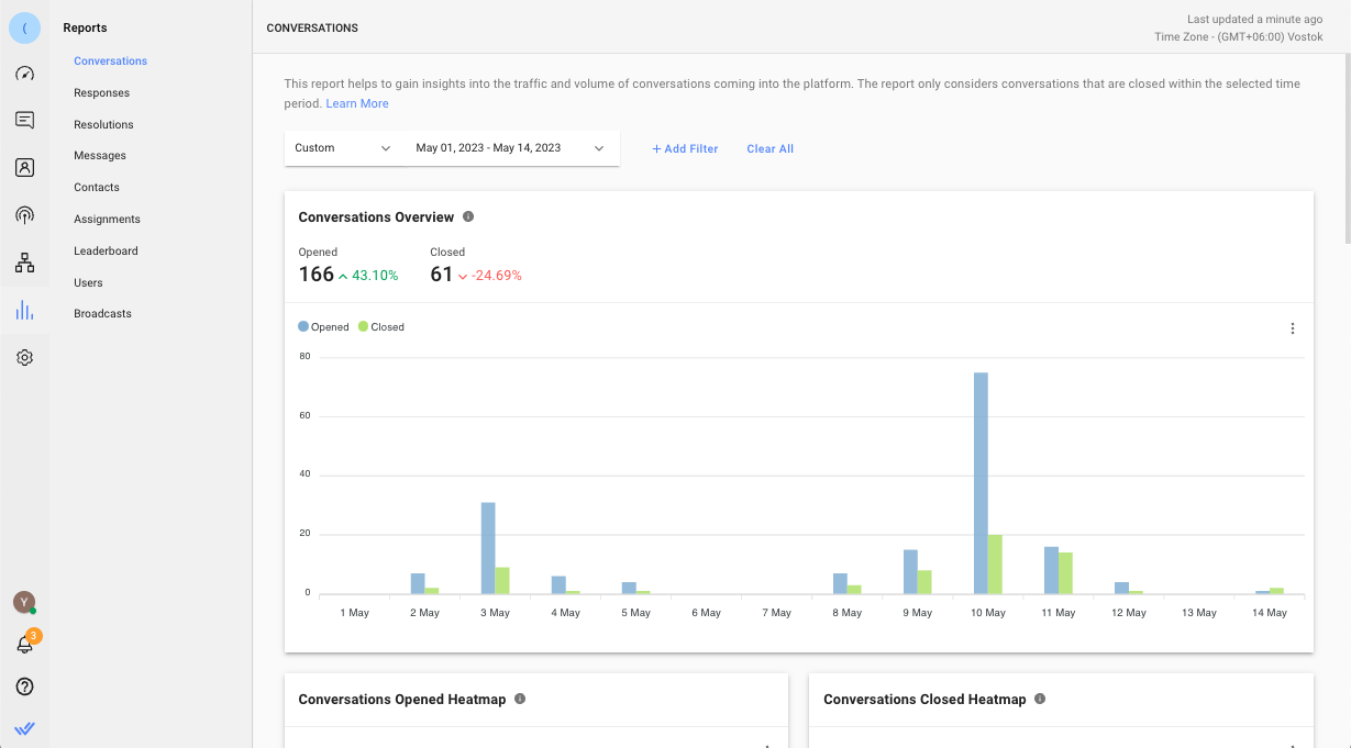
In this module, there are 9 reporting tabs. Each tab consists of metrics, charts and listings related to the entity. The tabs are as follows:

Each tab has its own set of report filters that enable you to perform in-depth analysis or create insightful information from the reports.
Some filters are only applicable to certain overviews in the report tabs. In this case, those overviews will be empty and indicated as not applicable.
The filters applied are retained on the user level and not affected by changes made by other users so that you can pick up from where you left off.
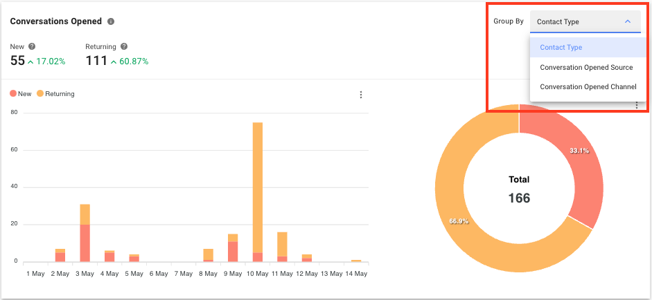
For charts that contain multiple breakdown options, you can click the Group By drop-down list to view the options available.
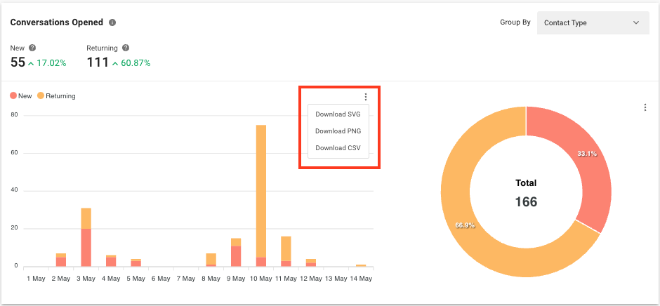
Click the 3 dots icon next to the chart to download the selected chart. There are 3 options available: SVG, PNG and CSV.
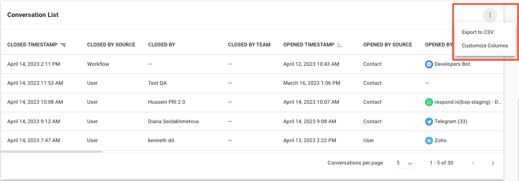
Click the 3 dots icon next to a list of data to export the list to a CSV file. You may also choose to display or hide columns to view only details that are relevant to you. Your selections will not affect the viewing of other users.
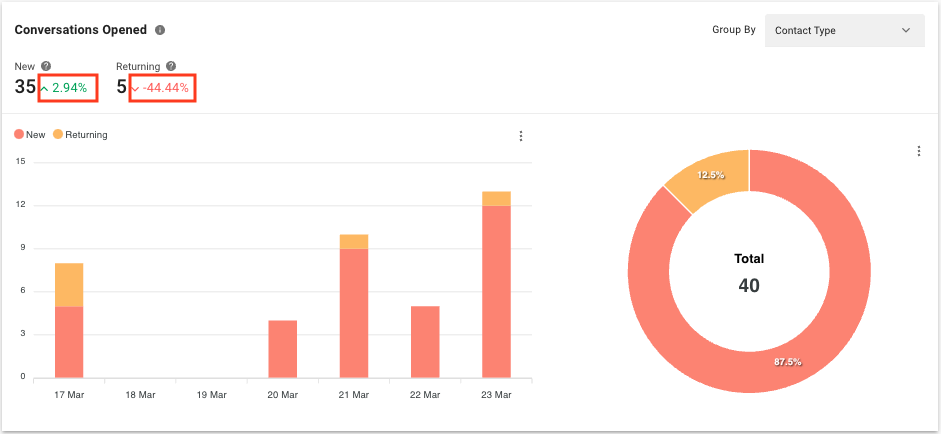
On the right side of the metrics shown in some of the charts, you can see a percentage of difference. The value is compared to the same period prior to the selected period. If the selected period is the last 7 days (e.g. 17 Mar - 23 Mar), the percentage of difference is compared to the 7 days prior to the last 7 days (e.g. 10 Mar - 16 Mar).
Yes, you can view historical data from one year ago, starting from the change date to the relevant plan.
The timestamp is shown in milliseconds. You can convert the timestamp to minutes using the following formula:
milliseconds / 1000 / 60 = minutes
For example, if the timestamp is 900000 milliseconds, to convert it to minutes, you would calculate:
900000 / 1000 / 60 = 15 minutes
Related articles 👩💻